Exercise: Curves

The last part is on curves. The text says that curves add grace and elegance.


This first photo is of a light signal, somewhat close up. There are curved lines in the main part of the light signal, as well as the hood. The most graceful in this photo is probably the curve of the bottom part of the hood. I would've liked to emphasize this more in the photo, but couldn't quite get the proper angle to do so. There are also some straight lines in the hood, and there are only a few perspectives that really show off the curve of the hood. For this particular one, morning would've been a better time of day I think.


The main curve in this shot is the body of the boat. Secondarily is the white trim line below the main curve, and then some curves on the boat itself, and then also in the floats between the boat and the dock. The diagonal lines in the dock seem to point towards the curve, and add some contrast that I think emphasizes the curve more in the photo than it would be without the diagonal lines.


This shot shows the curve of the railroad tracks, sweeping out of the picture. The fact that they are parallel really reinforces the motion. It's amazing how the second line more than doubles the energy flow. I think the contrast of light/dark on the rails at the curve itself makes the feeling of curviness stronger. It sort of emphasizes the curve.


In this photo, the curvy lines of the rope and float contrast with the diagonal planks. The lines of the trap are much lighter, but they are also curved. The rope feels very graceful in this photo. This is one of my favorite shots!

Exercise: Diagonal lines

The third part focuses on diagonal lines. As the text mentions, diagonal lines can be created easily simply by adjusting the perspective of the photo.


I took this first shot from a corner angle of a houseboat. There are multiple diagonal lines created by this perspective, the main ones being the three sets of lines that form the top of the first floor, the roofline of the main floor, then the roof line of the upper floor. There are a few other diagonal lines created but those are the strongest, and they repeat at essentially the same angles, however they converge at different points. I'm not sure how I feel about the convergence points. I wonder if the photo would seem more "put together" if the diagonals all converged in a similar way.


This photo is dominated by the diagonal lines of the railroad crossing sign. The telephone wires are also at a diagonal but don't have much of a relationship with the main diagonals. I like the photo, I think because it is somewhat offset, with the left part of the sign lower than the right, and the right higher than the left. Even though the diagonal lines of the telephone wires are separate from the sign, they do add some nice action in the upper part of the photo, which might have been dull without the wires there. Now that I think of it, the photo would've probably been stronger if the telephone wires had a stronger role. I need to think about that some more.


The diagonals in this photo are formed by the fluorescent light, the frame supporting the light, and the concrete support beams. Additional diagonal lines are formed by the shadows on the beams, and the highlighted spider webs. I really like this photograph. I like how the diagonals work together in shape and contrast, and the depth created by the upward diagonals formed by the shadows. It also feels quite balanced even though there are many places that the diagonals intersect. It's not busy at all.


The last photo is a stairwell in a parking garage. There are many strong diagonal lines in this photo: the handrails and the stair frames, the steps, and my favorite, the shadows of the steps on the wall. What's interesting about it is that the steps go against the flow of the handrails, but the shadows of the steps are parallel to the handrails. I love that. It's like the stairs are saying they really do want to go with the flow of the handrails and supports. I think that's what I really like about this photo.

Exercise: Vertical lines

Part two of the exercise on lines, this one looks at vertical lines.


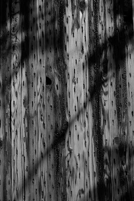
The first photo is a close up of a telephone pole. The small slits in the wood work together to form a pattern of vertical lines. And there are some darkly stained areas that form deep dark lines, and finally the grain of the wood runs vertically. There is shadow of a telephone line that creates a diagonal line which breaks things up and adds some interest.


This is a close up of corrugated metal on the side of a building. Highlights and dark areas form parallel vertical lines. What's interesting to me is that parallel vertical lines are less calming than parallel horizontal lines. I'm not quite sure why that is at this point. Vertical lines just seem aggressive somehow. That might not be the right word for it, maybe it's assertive. I guess it's like the difference between a person standing up and a person lying down.


This photo is of a piling in the left foreground, with boats in the background. The masts from the sailboats form a bunch of vertical lines. The sun was setting, and had just popped out from behind some dark clouds and really lit up the masts, especially against the dark sky. I like the swervy reflections of the masts in the water down in the lower right hand corner of the photo.


Last, here is a building with strong white lines against the background of dark windows. The trees on the right hand side are also vertically oriented, and break up the image a fair amount while still reinforcing the up and down flow a bit. Also, in this photo, I kept camera horizontal, so the vertical lines feel less exaggerated, and weaker. Less "assertive," if you will.

Exercise: Horizontal lines

This exercise looks at lines, and I broke it up into three parts: horizontal, vertical, and diagonal. First up are the horizontal lines.


This photo includes three primary horizontal lines: the horizon, the breakwater in the foreground, and the tops of the trees in the background. The body of the sailboat forms a much smaller horizontal line. The masts of the sailboat add some minor vertical lines which slightly disrupts the monotony of the parallel horizontal lines.


This photo has three parallel horizontal lines formed by the barbed wire fence. Even though the barbs look sharp, there's a fair amount of symmetry in the photo that to me makes this a calm photo. I would've thought the sharp barbs would give this photo a more agitated feeling, but the symmetry calms it down.


This is a closeup of the hull of a boat that was painted with thick black paint, in direct sunlilght. The lines of the highlights form horizontal lines, as do the shadows. And then there is the actual shape of the ridges which form horizontal lines. So this photo has parallel horizontal lines consisting of the thing itself, highlights, and shadows. Given the texture and shapes and lighting, I would've thought this photo would be more interesting than it is. I think the fact that there's nothing really breaking up the horizontal lines makes it kind of boring in a monotonous way.


Again, multiple parallel horizontal lines. This time taken in a parking garage at night. There are horizontal lines formed by the light itself, the beams, dark shadow areas, and the duct work at the bottom. I like how the light is balanced, bright in the upper left, and also brighter in the lower right, very dark on the bottom left. I think the way the light is balanced from one diagonal to the other makes the photo much more interesting than it would be if it was simply top to bottom or left to right. It gives it more depth. But again, the multiple parallel horizontal lines creates a calming effect, even when the subject matter itself is kind of harsh and rough looking. What I'm not sure about is whether it's just the repeating pattern that has the calming effect, or if it's the fact the lines are parallel and horizontal, and oriented the same way as the photograph.


So to experiment a little, I took this photo. It's from a tugboat, and these were stacked together and bonded together to form a kind of bumper. But what's interesting is that I turned the camera vertically, and the horizontal lines are very short. To me, there is nothing calm about the photo. Even though there are many, many more parallel horizontal lines than in the other photos. I think the fact they are shorter, don't go completely across from left to right, and the fact that they are in conflict with the orientation of the photo, all those work together to create a lot of tension. The edges of the stacks also form vertical lines, and so does the highlighted corners on the stack to the right. The eye is trying to figure out how to look at this, left to right or up and down, and can't really figure it out. Either way it tries to go it runs into a severe conflict. Fascinating!

Exercise: Multiple points

For this exercise, I experimented with various food objects placed together in different ways with the idea of exploring the relationship between the points in the various configurations. I actually struggled to find interesting objects to use for this exercise. I tried different types of food, I used shoes, and even a bunch of cufflinks. Ultimately I used the food because it's the simplest.


In this photo, I have two points, mostly balanced left/right and top bottom. The pepper is pretty close in tone to the cutting board, so it looks rather flat.


In this photo, I swapped out the pepper and onion for some limes, a lemon and two plums. I arranged them fairly symmetrically, with the dark plums on the left a lime in the middle of all the points. The limes are also very close in tone to the cutting board, so they don't stand out very much and add little in terms of energy to the photo.

I rearranged the objects to put some of the lighter objects between the dark plums, and set it up so the dark plums and light lemon create a sort of triangle between the plums and the lemon. The two limes are secondary influences in the photo, but the placement of the one partially outside the line between the two plums does weaken the feeling of the triangle. Because it's in line with the other lime and the lemon, it creates a tension between the shape of the triangle and the line. I think the triangle is a bit stronger than the line.


In this photo I removed the limes and introduced some grapes. The two plums and the lemon, being much larger, are stronger than the grapes, which look sort of dominated, even though they are relatively far away.

In this photo I removed the plum and added more grapes, which are mostly clustered together in the upper right hand corner. If you cover up the grape near the lemon, the photo has a totally different feel to it. It makes more "sense," if you will. The grape near the lemon creates an ambiguity for me that makes it difficult to resolve. The relationship between the objects is not nearly as clear.


This photo of multiple points is completely different. The white floats are the points amidst this tangled mess of netting and rope. What's interesting about this is that the points actually are connected by the rope running between the floats, but the the ropes don't follow straight lines. So the points are literally connected by somewhat arbitrary, even curvy lines, but also by imaginary lines you can't see directly. I thought this photo would be an interesting way to observe actual lines and and how they relate to implied lines. The end result to me is a lot more energy. It makes for a very dynamic photo.

Exercise: Relationship between points

For this exercise, I took some photographs of multiple points, and the purpose is to gain a better understanding of the relationship between the points. Specifically, it is to observe which is stronger and why.


In this first photo, I have a kayaker in the bottom right part of the photo, and a small group of kayakers in the upper left that sort of works to create a single point. To my eye, they appear just about equal in size, with the the group of three in the upper left perhaps a little bit larger, but with some gaps in them. They are also lighter boats and generate more contrast, also catching the eye. Also, the guy standing on the paddleboard creates some additional interest that attracts the eye. So I think the eye is first drawn to the group of the three, but then works back to the kayaker in the foreground, who is obviously paddling. The next thought is whether or not the one in the foreground is trying to catch up to the others. In the end I think the point in the foreground is stronger because it is closer, easier to see what it's doing, but mostly because it feels strongly like it's moving towards the others.


This is a photo of two metal objects on a brick wall. The larger one is a type of exhaust fan, the other is a light. In this photo, the exhaust fan is the stronger point. The main reason is that it's larger. Seconarily, I think because it's round, it works in contrast with the brick pattern. The light is smaller and squarish in shape, so it seems to fit in more with the brick pattern on the background.


In this photo of the same two points, I moved further back because I wanted to see what would happen if the two points were closer together in relation to the rest of the frame. Both points are weaker because they are smaller in the frame. And there's not much energy between the two points, the energy seems to be more about the points individually against the expanse of brick. I think the fact that the points appear closer together also reduces the energy between them. It's hard to say which is stronger. The fan is larger and in the center, but my eye keeps going to the light fixture first. I think in this case I go to the light fixture first because it does fit in more closely with the pattern of the brick, which is probably the most dominant first impression of the photo. So as the eye is moving around the brick it picks up the light fixture first. Very interesting.

Excercise: Positioning a Point

For this exercise, I took three photographs of single point, placing it in a different part of the frame in each one. I choose to photograph a person kayaking near where I live. The text says that there are essentially three different areas to place a single point: in the center, slightly off center, and close to the edge. So that's what I've done here.


In this first photo, the kayak is in the center of the photograph. Because of the tonality, I would say that the vest on the kayaker really stands out the most, the kayak and water are very close in tone, so I think the kayaker is actually the point here. The light end of the paddles also cold be considered points. I didn't realize this at the time! You can subtly see the lines from the bottom of the photograph up to the back of the kayak formed by the wake of the boat's movement. Very subtle but there enough to show movement. I noticed these when I took the photograph and was curious to see how it would affect the image.


I placed the point off center and slightly up. I was experiementing to see how having the expanse of water to the left of the photo would affect the energy of the photograph. I also thought that having the kayak pointed slightly toward the expanse of water but not entirely would create some tension. I think it does. If it was pointed in the same direction of the expanse of water (more to the right) it would be going with the flow. But in this case it is only slightly against the flow, which I think gives a little feeling of balance. If it was pointed more to the left, I think it would create more energy.


In this last photo, I placed the point near the edge towards the center. I took this photo because I wanted to see how it affected the energy to place the point in the center/top. I thought there would be more energy because the expanse is directly between the viewer and the point. But in fact, it feels to me like there's much less energy in the photo. I think it might be because of the notion I wrote about in the previous photo, the boat is pointed directly out of the photo and is going with the flow of the energy, for the most part.

Feedback on First Assignment: Contrasts

Generally, I was pleased with the photos I submitted for the first assignment, and I was pleased with my tutor's feedback. In a nutshell, I would say about half of my pairings worked quite well. The other half didn't. The main reason they didn't work was that they didn't clearly communicate what I intended. Even though I received positive feedback on the overall quality of the photographs, the main point of the assignment was to clearly communicate something. Indeed, my tutor provided great feedback when he said, "Art is about communication."

This is what I struggled with as I put together my pairings. On the one hand I wanted to be creative but for the pairings that didn't work, while I may have been creative, I didn't communicate clearly enough.

For example, in this pairing, I chose to communicate translucent and opaque. The first photo is pretty clearly translucent, and needs no title or explanation. The second photo is supposed to be opaque, but it's difficult to tell what is opaque about it. The "opaque" in the photo is the lettering the signage that partially spells out what the building is. One must read the shadow, cast by the opaque lettering, in order to fully read the sign. I thought that by showing the relationship between the relationship between the sign and its shadow, the viewer would experience opaque.

I will say though, that the opaque photo is probably the very first photo where I actually felt like an artist. I noticed the relationship between the sign and its shadow out of the corner of my eye when I was driving down the street and it immediately struck me. So I parked my car, and fortunately had my Hasselblad with me. The composition came together very easily and the final product matches almost exactly the vision I was going for. So even though it didn't work for the assignment, it is an important photograph to me.

:


I did have some pairings that worked well. An example of this is my "Straight/Curved." I like both of these photos because not only to the visually communicate what they're suppose to, they also express the feeling I was going for in each. Especially the curved guitar. With this one, I played around with the positioning, lighting, and exposure to get the sharp contrast along the curved lines as a way to draw attention to that area. I think it worked well, and I was pleased with the results.


The final example I'll share here is my photo that shows both contrasts in the same photograph. For this one, I chose "Still/Movement." This is a photo of a water feature at an office building. I exposed it for about 1 minute to capture the movement of the water. I positioned myself so I could place the highlight at the top of the waterflow so the eye would certainly be drawn there then follow the line down to the light area where the waterfall enters the pond. I think this clearly shows movement. The sculpture itself is still, but so too are the trees in the background, and the rock feature in the pond. Highlights in the trees near the pond form a shape that almost identically matches the shape of the rocks, which I feel helps pull the composition together. I was a little bit concerned the photo might be too dark, but I think it holds up well, and I'm not experienced enough yet in the darkroom (or with photoshop) to lighten it without raising up the highlights too much. And in the end, I think it works as is.


All in all, I was quite pleased with my photos and the very constructive feedback I received from my tutor. In future assignments, I will work to err on the side of communicating more clearly, even if it results in simpler compositions.

Putting together my shots for the contrast assignment

I've been working hard on the first assignment, contrasts. I think I have all the pairs of contrasts, but I'm not sure if I have the best shots for each one. One of my big takeaways from this assignment is how hard it is to pull it all together.

First, there's the concept, and there's the execution. I've had ideas that I thought would work, to show soft, or diagonal, or whatever, then when I take the photo, it doesn't really come across, even if the shot is well executed. I've discovered that sometimes the concept doesn't work because it's either a cliche, or on the end of the spectrum, comes across as too hokey, sophomoric, or silly. I would also say that I'm still getting used to the idea of creative shots, so I don't have much of a feel for how well the subtleties will come across. So there's this balance on the conceptual side between being creative and unique, but also communicating clearly without laying it on too thick. I guess a lot of the decisions along these lines begin to reflect my style. Perhaps as I get more experienced and develop and become aware of my style, I will gain more confidence.

Then there's the execution. It's amazing how often I got the concept right, but either the light wasn't quite right, or my camera wasn't quite level, or I got a kink in the film while I was loading it onto the spool. Or there's dust on the negative I just can't get rid of. Or the shot's not composed just right. So many factors, and each one of them is a place where it can go wrong. I've discovered that I'm a real perfectionist!

Then there's deciding which are the best examples of each shot. After looking at so many shots for so long, I think I'm beginning to lose perspective.

I would say that working on this assignment for the past month has literally made my eyes open wide. I started out having a hard time thinking of or seeing examples of many of the contrasts. But now, I can be driving down the street and see something out of the corner of my eye that looks like it might work for one of the topics. It's also amazing how you can find examples of these contrasts in a very limited geographical area. I could have done all of them at the nearby marina, if I wanted to. When I first started this project, I never would've believed that. And while I'm seeing what I'm looking for, I'm also just seeing much more. I notice the subtle changes in the light right away. I see small details on the sidewalk while I'm walking down the street. I see the relationship between an object and its shadow. Pretty cool.

Exercise: Vertical and horizontal Part 2

Went back to the marina and took a sequence of photos using a horizontal frame. Again, I used the digital and took many photos. I tried to get some of the same shots, but horizontally. For the most part I was able to get many of the same subjects, but a few boats were gone the second time.


Interesting how the boat doesn't feel as long taken horizontally.


I used a wide angle here, because without it really wide this would've been a really uninteresting photo.


This dinghy feels smaller and you don't get a good feel for the lines in the boat.


I think this would work better closer in. One of the more interesting elements is the buoy hanging down in the middle, but from this distance, it's lost.


I think this worked much better vertically. In this shot, there's too much extra space that detracts from the interesting part of the photo. I wasn't able to get the fish and the block above it, with some of the pier above and below, unless I pulled back and got all that distracting boat in the background.

Exercise: Vertical then horizontal frames

First up are the vertical photos. For this project, I took a sequence of photos framed vertically at the marina, which is one of my favorite places to shoot. The exercise is designed to help me think more about composing vertically. The text says that we have a tendency to think first about framing horizontally, in part because that is a more natural way of looking at the world. So this project was designed to get us to think more about composing vertically.

At the marina I found no shortage of subjects that lent themselves to a vertical composition, all the piers and masts going up would naturally call for a vertical framing in many instances. So, I conciously decided to seek out other subjects to compose vertically. I used the digital camera and took literally hundreds of photos, but will only post 5 here.


This first one has a tall pole would naturally called out for a vertical composition.


This is a dinghy, that by shooting vertically seems to give it a longer feel to it.


Front of wooden sailboat.


Front of motorboat, with anchor. This vertical orientation makes the boat feel really long, it's actually much shorter than it appears here.


This is my favorite. I like the mix of shapes and textures, and also the contrast of the lighter fish shape on the darker pier. I think the vertical orientation helps give the right space for the shapes to work together in a balanced way.

Exercise: positioning the horizon and experimenting with cropping

For this project, I experiment with placing the horizon in the middle, top, and bottom of the frame. Then I added a subject on the left side and repeated the exercise.

The horizon in the middle is generally boring unless there is some compositional reason to place it there. When I was composing for this exercise, it was very hard for me to just put it in the middle without anything else in the photo, so I lined up the three boats. I found that with this composition, it made the horizon in the top the most boring.

Using my wide angle on the zoom (with the digital camera), I added the boat at the dock on the left. It's up close and adds some interest regardless of where the horizon is placed. With the compositional element in the foreground, the placement of the horizon works or doesn't work based on how it relates to that compositional element.


I added the boat to the left which brings some interest into the foreground. This is with the zoom set on 18mm. I like the wide angle used close up on a subject.


This probably my favorite shot of the sequence. I like the boat on the left, and the lineup of boats going across towards the top right of the photo. The clouds are interesting in the top portion of the photo. Even though there's nothing happening in the lower right portion of the photo, I think it's okay. It gives a feeling of space. Might be better with the bottom cropped some though, so the boat in the foreground touches the bottom edge of the picture.


This just seems odd. I like how the boats are lined up again, but I think we don't get enough of the boat in the foreground. And with this framing, it emphasizes the lineup of boats. I think it's because the decks of each boat feel lined up and the deck of the boat in the foreground is emphasized so that's where the eye starts. It makes the eye sort of skim from one boat to the next. Might have worked better if I crouched down to take the shot. I like the sky though, and the American flag is also interesting.


I cropped some off the bottom of the second horizon/top shot so that the boat touches the bottom edge of the photo. I like the feel of it. Also like how the angle of the bottom of the boat is now more emphasized and points towards the other boats. That line craws the eye as much, if not more than the line created by the deck. Either way, both lines point towards the series of three boats in the distance. But I do miss the curve on the bottom of the boat that is now missing. I might try to crop it so that is retained. And without the extra water, you get less feeling of open space. It feels less expansive. I guess that's one of the tradeoffs.


In this one I cropped of some of the bottom, but didn't bring the boat to the bottom edge of the photo. I like the other two versions better. I don't think this works because it's too low to get a feel for the curve off the bottom of the boat, but not low enough to bring in the new dimension that's created by having it extend beyond the bottom edge of the photo.